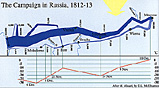
Described as "the best statistical graphic ever drawn" and used to teach graphic design, the diagram below is based on an 1861 original by Charles Joseph Minard (1781-1870), a French engineer. It shows the terrible fate of Napoleon's army in Russia, portraying its devastating losses. Starting at far left in June with 422,000 men (some sources claim nearly 650,000 with reserves and the forces on both wings), the width of the band indicates size, location, direction and temperature at various dates on a two-dimensional surface. The actual numbers in the invading force, and true losses, are still a matter of debate.
Statistical Graph (medium--52K)
Statistical Graph (jumbo--147K)
-
Back to Introduction
Overall Russia Campaign Map (slow--137K)
1812 Excerpt (part 1)
1812 Excerpt (part 2)
Rear Guard Action at the Berezina Crossing
Statistical Graph
Berezina Crossing Order of Battle (text--fast)
Berezina Crossing Order of Battle (graphics--very, very slow)
Berezina Diorama
Back to Table of Contents -- Napoleon #6
© Copyright 1996 by Emperor's Press.
This article appears in MagWeb (Magazine Web) on the Internet World Wide Web.
The full text and graphics from other military history magazines and gaming magazines are available at http://www.magweb.com