Let's take Gamble first and see how the standards we've outlined in the previous two columns apply.
The rules should tell us how to play the game.
Gamble's rules do tell us just that, straightforwardly. In addition, the rules contain several "Design Notes" that are the direct cause of the retraction in the next paragraph.
[Retraction.- In the past, I have lobbied against "design notes" and written and said some severely disparaging things about them. I should have qualified those statements more carefully: in Gamble I have now seen design notes that significantly contribute to our understanding of how to play the game. They are not rules, but explanations of rules: they help us understand the rules and their application to playing the game. This kind of "design note" deserves praise, not censure. However, I will still condemn the notes that do not contribute to our understanding of how to play the game; that merely add dashes of popularized history, "color," or self- advertisement; or that, worse yet, give the designer an outlet for his non-existent sense of humor.]
The rules should be organized logically. Gamble has some faults of logical organization, but they are not misleading. For example, 2.0 Game Components has divisions into Components List, The Map, The Counters, Combat Units, etc. It's clear that 2.4 - 2.16 should be logical subsets of 2.3. Again, at 6.0 Terrain the logic is at fault: 6.3 Movement on Roads and Trails, one of the effects of terrain on movement, should be a subset of 6.2 Terrain Effects on Movement. More serious is the sequence of the headings (see below).
The rules should be presented in the order that the gamer needs to know them.
Gamble does not conform to this standard at all. Its non-conformance may be a question of logical organization or a question of sequence; but, either way, the gamer does not encounter the rules in the sequence that he needs to know them.
For example, 5.0 Sequence of Play begins with determining the Confederate army's command status, which is treated at section 16. Why should there be ten intervening sections of rules (and seven threc-column pages) between the Sequence of Play and the first rule the gamer needs?
The rules should separate non- playing information from playing information.
That is, separate the SOP rules from the other rules. In this respect, Gamble falls badly. Immediately after 5.0 Sequence of Play comes 6.0 Terrain, 7.0 Unit Status, 8.0 Movement, of which only the last figures in the play sequence. The playing and non-playing rules commingle throughout.
The rules should contain complete "housekeeping" coverage. Gamble does contain complete coverage here, although it is intermixed with SOP rules, as mentioned above.
Where appropriate, the rules should cross-reference related rules. Gamble does just a superlative job at this task: indeed, the extensive cross-referencing in these rules goes a long way towards mitigating the effects of illogical organization and sequencing noted above. Although the gamer will continually have to flip back and forth in the rules as he learns and plays the game, at least he will have these cross-references to guide him
The rules should present examples of play.
Gamble gives us both discussion-type examples and purpose-drawn illustrated examples; and, as already mentioned, the "Design Notes" offer further examples. The illustrated examples are especially effective: they both' explain the illustration and reference the pertinent rule(s).
The rules should adhere to the conventions of language, presentation, and typesetting.
In all these standards, Gamble does a, first-class job. The language in the rules is particularly clear - I found myself having to re-read only one or two sentences.
The sentences say what they mean, without ambiguity or ornamentation; and the meaning comes through clearly. The page presentation and typesetting have only one or two small faults. The basic typeface is the new cutting of the old Palatino, nine points with two points of leading on a thirteen-pica-deep line, three columns; the section heads are 14-point boldface Helvetica - all very readable. (However, the type in the illustrated examples is a difficult-to-read twelve-point san-serif. It almost looks as if somebody was trying to make the typesetter fill the available space.)
The counters will be designed and executed so that the player can immediately know whom the counters belong to, know what values the counters present, and discriminate necessary information from unnecessary information.
Gamble's counters fill these requirements admirably. The counters are crisp and clean, with background colors (light blue and tan) easy to tell apart and from the map colors, with outlines thoughtfully facing in different ways (the Confederates face right; the Union troops face left), and with easy-to-read information (although it is sometimes difficult to distinguish necessary information from unnecessary information). Gamble has 190 counters, of which just under 140 are units in play and the rest are administrative.
The map will use color sparingly and consistently.
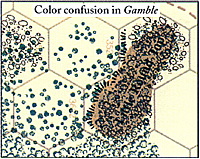
Gamble's map meets this standard quite well. The basic color for the map is a very pale beige, which tends to disappear nicely during play and avoid the glare of a large white area. The other terrain features use a darkish green and the standard woods symbol for forested areas, the same green and an orderly line of symbols for the orchards, a bright blue for the streams, and a neutral brown for the elevations. (This last may be a bit dark; see below.)
 The map will avoid harsh
colors.
None of the colors on the map is harsh, although the blue of the streams might be a bit bright. However, the combination of colors and terrain symbol and typesetting makes the terrain on the Round Tops difficult to read: they should both be rough, wooded hills. Big Round Top has a steep slope on all hexsides; Little Round Top occupies two hexes, with steep slope on three western hexsides.
The map will accurately represent the battlefield.
As well known as this battlefield is, and with as many references available as there are, you'd expect that any wargame map of Gettysburg would be accurate; and, within the limitations of the abstraction for the hex grid, the topography for Gamble's map checks out well with, for example, The West Point Atlas of the Civil War.
However, some of the roads got severely mis-named: "Fairfield Road" should be "Hagerstown Road"; "Cashtown Pike" should be "Chambersburg Pike"; and "Middletown Road" and "Carlisle Road" should be exchanged. (However, none of this has any effect on playing the game.)
The portion of the battlefield included for the game seems appropriate for the scale of the game: the narrow edge of the map runs North- South, and the village of Gettysburg has been located about two-thirds of the way North and just off center to the West. The grain of the hexes runs East-West.
The map will contain as much playing information as it has room for.
Gamble's map contains a handy, clear strip of terrain symbols-, a day track and a turn track; and, for both sides, boxes for routed and eliminated units, destroyed cadres, army command status, and hidden movement.
Play-aid cards will conform to the standards for rules, counters, and maps.
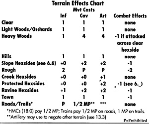
Gamble needs only one page of play- aids, reproduced on the back page of the rules booklet. The whole page is set in Helvetica, most of it bold or extrabold faces; it's correspondingly difficult to read. (A last-minute [?] addition to the footnotes to the Terrain E ects Chart somehow wound up in Palatino.) The book- weight face is too large - about thirteen points, in some cases larger than the table it purports to be a footnote to - for comfortable reading.
 Play-aid cards will contain
references to pertinent rules.
Gamble's card contains five references to rules sections: it would benefit from many more.
Play-aid cards will conform to professional standards for tables, charts, etc.
Generally, the card is badly laid out. Some of the more glaring lapses are:
- In two dimensional tables, both
dimensional columns should be labeled. In the
CRT, the die-roll column is labeled-, the other
dimension is not. (It's the differential, attacker to
defender). In the Bombardment Table, neither of
the columns is labeled. (The vertical column is
the die roll-, the horizontal dimension is the
number of units firing.)
In general practice, multiple (combined) columns receive subheads on the same row. In the Terrain Effects Chart, "M Costs" (should have been spelled out) and "Combat Effects" are coordinate and belong in the same row.
- General practice involves setting the column (and row) headings in a typeface different from the table entries. In all of these tables, the typeface is identical.
- Footnotes must match the internal references to them. In the Terrain Effects Chart, there is a single asterisk, a double asterisk, and a triple asterisk; in the notes there is only the single and the double, and the triple is unaccounted for.
The Armchair Gamer Gettysburg, by XTR, and Gettysburg, by XTR; An Important Retraction; and a Lengthy Aside
Back to Table of Contents GameFix # 4
Back to Competitive Edge List of Issues
Back to Master Magazine List
© Copyright 1995 by One Small Step, Inc.
This article appears in MagWeb.com (Magazine Web) on the Internet World Wide Web.
Other articles from military history and related magazines are available at http://www.magweb.com