A few months ago I was faced with the task of painting a selection of 25mm Saxon, Viking, Norman, and Scots Highlander figures for skirmish gaming. Now, although I have read extensively of this period, admired other people's armies, set up a campaign, and even developed sets of rules for it (including those for the skirmish gaming), I had never actually got around to painting any figure myself.
This left me facing the great wargamer's dilemma. An historian can constantly hedge around the question of clothing colours, but a wargamer has to paint his or her figures. I wanted something more than the briefest of colour guide given in the WRG books, but I didn't want t spend weeks or months waiting for a inter-library loan to come up with some obscure academe works. This left me with the couple of shelves of books I own on the period, and a pile of notes built up over the years. But these prove remarkably unforthcoming as regards clothing colours. So, for those gentle readers who may find it of use, this is what I did.
Schemes
Given that hard facts on the matter were absolutely as rare as sunshine in a British summer, I decided that my figures should have the right "look and feel" rather than being (dressed in semi-academic guesswork. For me, the look and feel of any period comes from the contemporary depictions of that army. Thus I decided to base my colour schemes on the illustrations available modified by the small amount of archaeological evidence on hand.
This proved much easier for some peoples than others, given the uneven nature of my stock of books. For the Saxons I followed the colour schemes used in illustrated manuscripts, modified by evidence from the Bayeux tapestry and archaeology. For the Normans I had only the Bayeux tapestry, but I also bore in mind the data derived for the Saxons. For the Vikings interestingly enough, I had no contemporary coloured illustration bar the Oseberg tapestry which appears to make no effort to depict realistic colours. However, there was some archaeological information.
But mainly I decided that Angus McBride's paintings in the Osprey "Elite" series book on the Vikings conveyed what seemed to me the right look and feel, and hopefully he had been provided with some fairly extensive costume notes by Ian Heath, so I based my colour schemes on these.
Finally, the Scots Highlanders -- information on these chaps is not easy to come by! Firstly, one has to decide what they looked like. I settled for Picts with some Viking influence, and based my choice of figures on the Pictish carvings and late Medieval/Renaissance depictions of Scots. And basically, these were the same sources I used for clothing colours. Angus McBride's depiction of Picts in Osprey's Arthur and the Anglo-Saxon Wars, Richard Scollins's paintings of Scots at Stirling Bridge and Falkirk, and sixteenth-century descriptions of Highlanders.
For those of you who have not been completely put off by my choice of sources, here is the fruit of my (fairly brief) research. Both for the basis of my rules, and as what appears to me a valid social distinction, I have differentiated between "nobles' and "peasants". In this context, "nobles" is used to cover the class of warrior found in retinues as well as the nobility and minor nobility and "peasant" refers to the levels of society that made up the bulk of the armies and the servants of the "nobles."
SAXONS
My principal sources were illuminated manuscripts reproduced in colour plates in the more luxurious (who said "coffee table"?!) books. The quality of reproduction varied, and I developed the strong suspicion that some were using colour enhancement. Bearing this in mind, I came up with the following range of colours: brown, very pale brown (varying from almost a beige through cream to a pale fawn), yellow-brown (or buff), yellow, orange, red (covering dull red, browny red, pale red, and scarlet, the last being virtually confined to the "nobles"), pale blue (varying from grey-blue through sky blue to pale indigo), dark blue, dark green (either a dark grass green or a sort of olive drab), and white.
I took things further than this, however, as a bare list of colours is not much to go by. You will see a lot of men around you wearing white shirts, but how many are wearing white trousers? Therefore I broke the colours down by clothing item -- tunics, leggings, and cloaks. This enabled a better cross reference with my other major source, the Bayeux tapestry.
Bayeux tapestry
 The Bayeux tapestry uses eight colours: brick red, pale green (but not very bright), dark green (again a dull shade), blue-green, grey-blue (with the accent on grey), very dark blue (almost black), yellow,(a saffron shade), and yellow-brown (roughly ochre). This immediately tells us two things: that these colours were available in the later eleventh century, and that the dyes have proved remarkably lasting.
Now, we all know about the Bayeux tapestry and its green horses, but given the limited choice of colours employed, they have been used for contrast and effect. By studying the things they are used for and the use of juxtaposition, it is possible to get a feel for the "extra" colours they are trying to suggest. Although there was a high degree of correspondence between these two sources, there were also some significant differences.
Only the tapestry depicted black tunics and leggings, or rather dark blue. Black is a rare colour in the manuscripts, confined apparently entirely to shoes. On the other hand, it could be that the tapestry was trying to depict a lighter blue, but blue deeper than pale blue is rare in the manuscripts as well. I finally decided to treat it as dark blue for the "nobles," and black for the "peasants."
Similarly, red tunics and leggings for peasants appear only in the tapestry. Given the tapestry's use of red elsewhere, I think we can assume that many of these occurrences are meant to depict brown. Conversely, orange and pale blue only appear in the manuscripts. It could be argued that, the tapestry used grey/blue to depict pale blue and this is what I assumed. Orange is used extensively in the manuscripts for all classes, and I decided to use it (like pale blue) because I felt it gave precisely the sort of "look and feel" I was after.
Finally, I did come across a little archaeological evidence. Excavations at London produced the following statistics for cloth samples found on mid-Saxon-period sites: 58 percent were undyed wool, 15 percent were dyed with madder, 8 percent with woad, 8 percent with indigo, 8 percent with a woad/madder mix, and 4 percent with an indigo/woad mix.
Now, undyed wool can cover a multiple of sins from white (bleached) to black, depending on the type of sheep providing the wool. It could certainly cover very pale brown, and probably most of the browns. Madder gives red, although a fairly dull red. Woad will give a pale to mid blue, depending on the concentration. Indigo gives a dark, slightly violet blue. The two mixes would give mauve and purple respectively. Excavations of early period graves provided many examples of strips of rich cloth, often of silk and/or incorporating gold thread, used for decoration (probably edging) on clothing.
Yellows and Greens?
Perceptive readers will have noticed the absence of any yellows or greens from the archaeological evidence. How do we account for the yellow-brown, yellow, orange, and greens discussed above? Well firstly the tapestry itself shows that green and yellow dyes were available, and secondly cloth samples from Viking York show the use of weld as a dying agent, giving yellow shades. It could be that Londoners never wore greens or yellows, or there could be some undisclosed factor distorting the statistical sample. (The size of the sample is not stated.)
Archaeology has added mauve and purple to our list of colours. Purple is used in twelfth century manuscripts as a clothing colour. Personally, I have borne the mauve possibility in mind when choosing red shades, and added the occasional touch of purple for the very highest class figures. (On rechecking my sources before posting this article I did find two possible examples of purple cloaks in the manuscript illuminations.)
The table at the end of this article lists the colours for painting your figures. I have classified them as common, occasional, and rare based on the evidence. Rare means there were probably no more than two or three examples in everything I looked at, being a little over forty figures in manuscript illuminations and sixty-odd on the Bayeux tapestry. Occasional covers anything from half a dozen up to fifteen examples, and common is everything more than that.
| Noble tunic | ||
|---|---|---|
| Common | Occasional | Rare |
| dark greens | orange | pale green |
| reds | very pale brown | pale blue |
| yellow browns | - | dark blue mauve, yellow |
| Noble leggings | ||
| reds | dark blue | very pale brown |
| yellow browns | pale green | - |
| dark greens | - | - |
| Noble cloaks | ||
| reds | dark blue | orange, purple |
| yellow-browns | very pale brown | pale green |
| pale blues | dark greens | - |
| Peasant tunics | ||
| reds | brown, orange | mauve |
| yellow-browns | pale blue | dark blue/black |
| dark greens | - | very pale brown |
| Peasant leggings | ||
| red, bare, dark green | yellow-brown orange, pale blue | dark blue |
Peasants' cloaks: There are none at all depicted on the tapestry. There were five in the manuscripts, two pale red, two dark green, an one pale indigo. They appear to be unlined an generally shorter than those of the nobles.
General comments: Strapping on the legging appears de rigueur for the nobles, but rare for the peasants. Nobles' tunics are normally edged at collar, hem, and cuffs. I would suggest that yellow-brown in this context could well represent gold. Peasants' tunics are normally edged at the collar.
Shields: The following colours were depicted on the Bayeux tapestry:
- Common: red, yellow-brown
Occasional: white, blue-green, grey-blue, dark blue
Rare: dark green
 I found only one colour depiction of a shield in the manuscripts. It was orange.
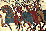
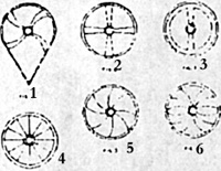
On the tapestry, 80 percent of the shields were tear-drop shaped and 20 percent round. Of the teardrop shields, 19 percent were plain, and 50 percent decorated with only studs (or just possibly small painted circles). The rest had a curved cross design (see fig. 1), and many of these were decorated with studs as well. Of the five round shields, two were as figure 2, two as figure 3, and one plain.
In the manuscripts, all shields were round, and half of them were undecorated. However, it should be noted that the nature of some of the sketches probably precluded the inclusion of such detail as shield designs. The decorated examples were split between figures 4, 5, and 6.
Back to Saga #56 Table of Contents
© Copyright 1996 by Terry Gore
This article appears in MagWeb (Magazine Web) on the Internet World Wide Web.
Other military history articles and gaming articles are available at http://www.magweb.com